
Kangwon National UniversityCollege of Medicine · School of Medicine
Korean
mobile
KNU Kangwon National UniversityCollege of Medicine · School of Medicine
user
service
KNU USER SERVICE Main services by user
About
UI
KNUSM standard symbol
Symbol
- Kangwon National University has introduced a new UI to leap beyond the level of a regional hub and a leading university in Korea to become a “Worldly Competitive University." The new UI was built around “KNU,” the English initials of Kangwon National University. It symbolizes Kangwon National University's global, dynamic, and creative approach, which breaks the framework of thinking and extends into the future world through the rising square motif. In addition, the talented image of Kangwon National University, which leads to change for the future, was expressed in a simple yet impactful design.
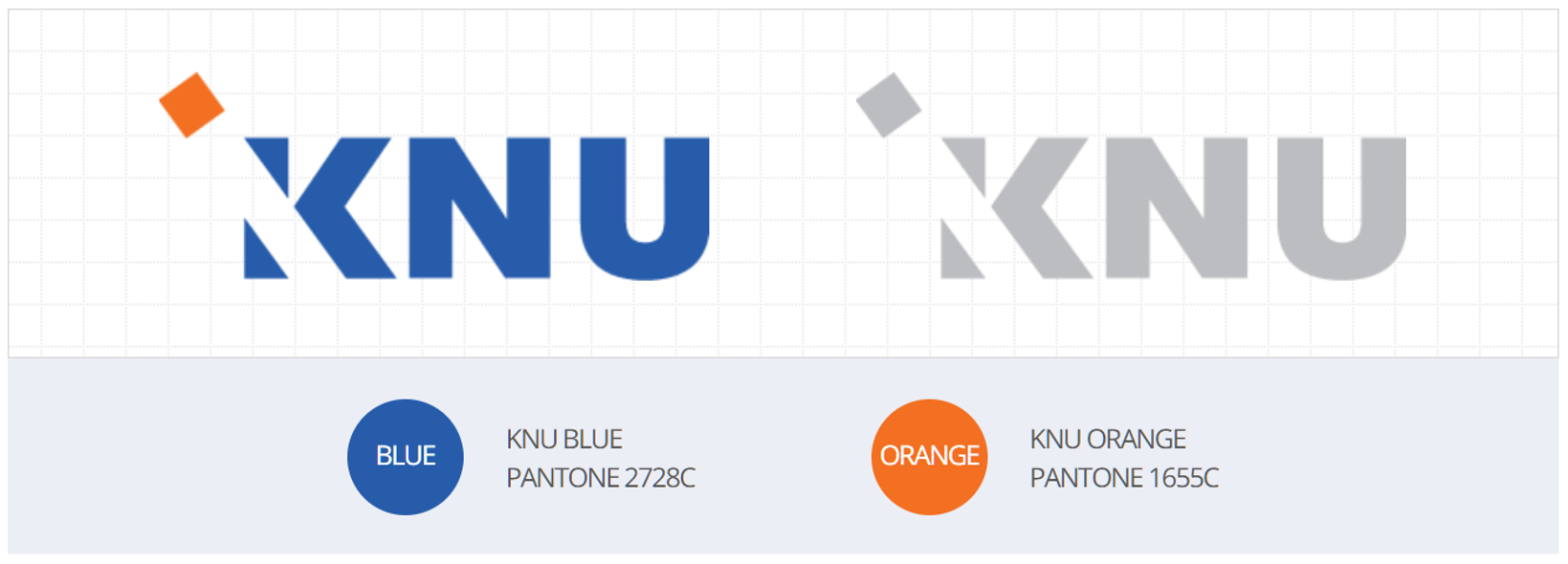
KNU’s blue expresses the cradle of global talent and creative learning and metaphorically symbolizes insight and thinking ability.
KNU’s orange symbolizes the 21st-century global leader who moves into the world based on global competitiveness and metaphorically expresses a passion for a bright tomorrow.
Overall, it expresses the image of a future-oriented global university that aims to prepare for the future and move forward in the world by breaking away from the old image of the past in a modern and sophisticated way.
Up & Down signature
- The up-and-down signature refers to a combination of a word mark and a logo, which are key elements of CI. Up-and-down, under a certain standard, can be used by selecting an appropriate one according to the layout or situation of the applied medium.

Side signature
- The left-and-right signatures refer to a combination of word marks and logos, which are key elements of CI. Left-and-right, under a certain standard, can be used by selecting an appropriate one according to the layout or situation of the application medium.

Emblem
- The emblem was created by combining the newly changed mark and logo type, and can be appropriately used across various media as it symbolizes the authority and tradition of the University.